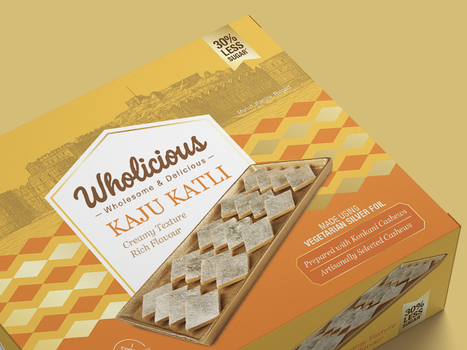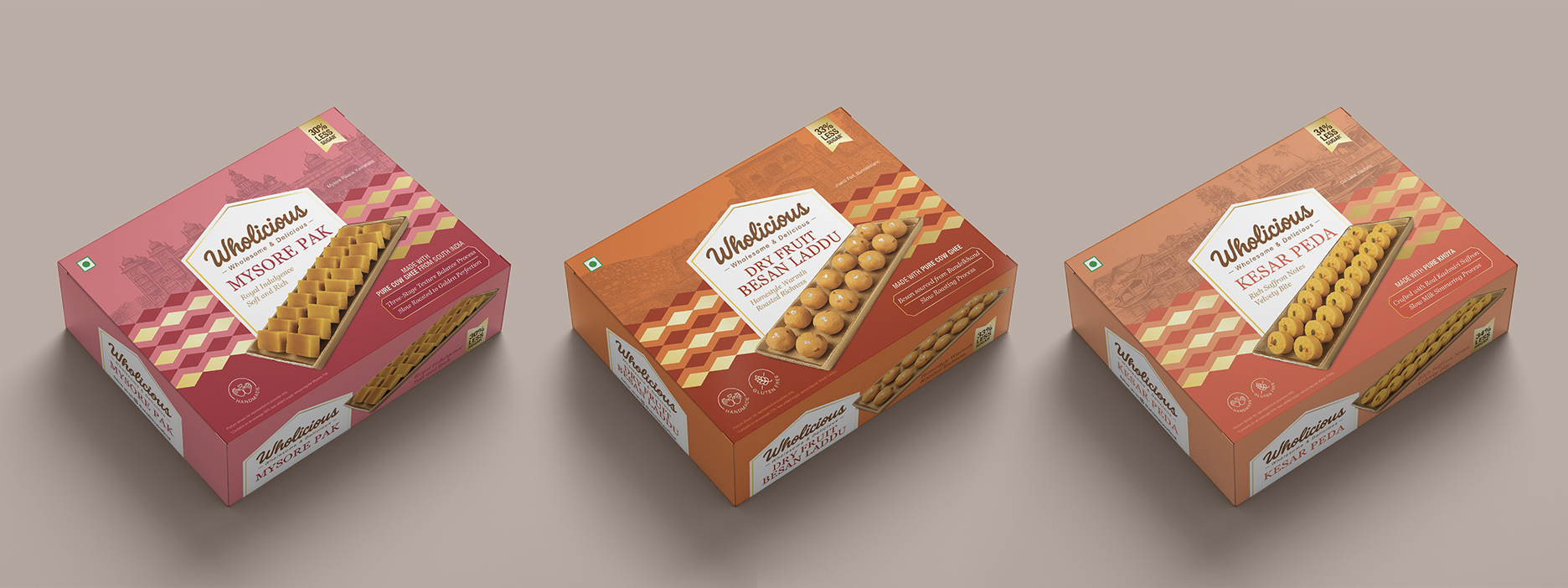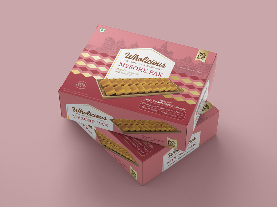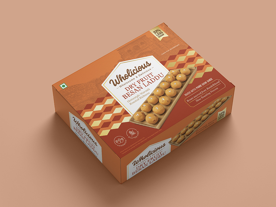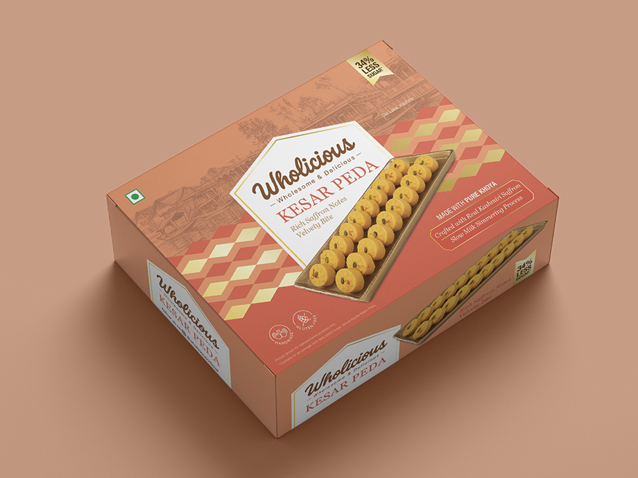
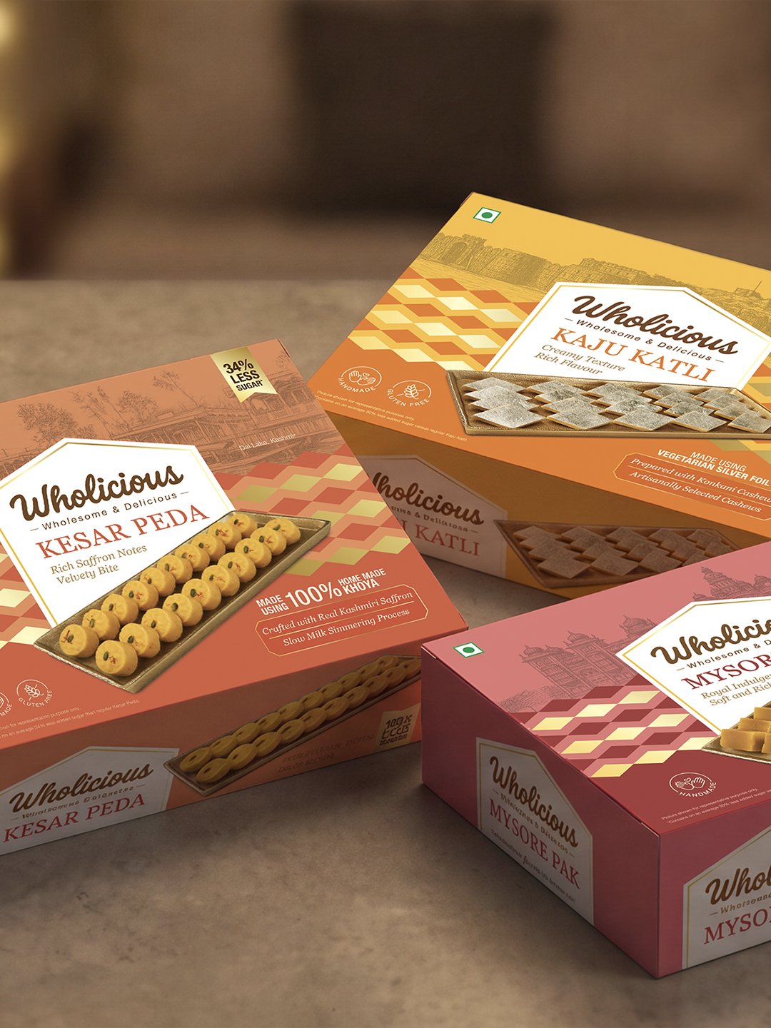
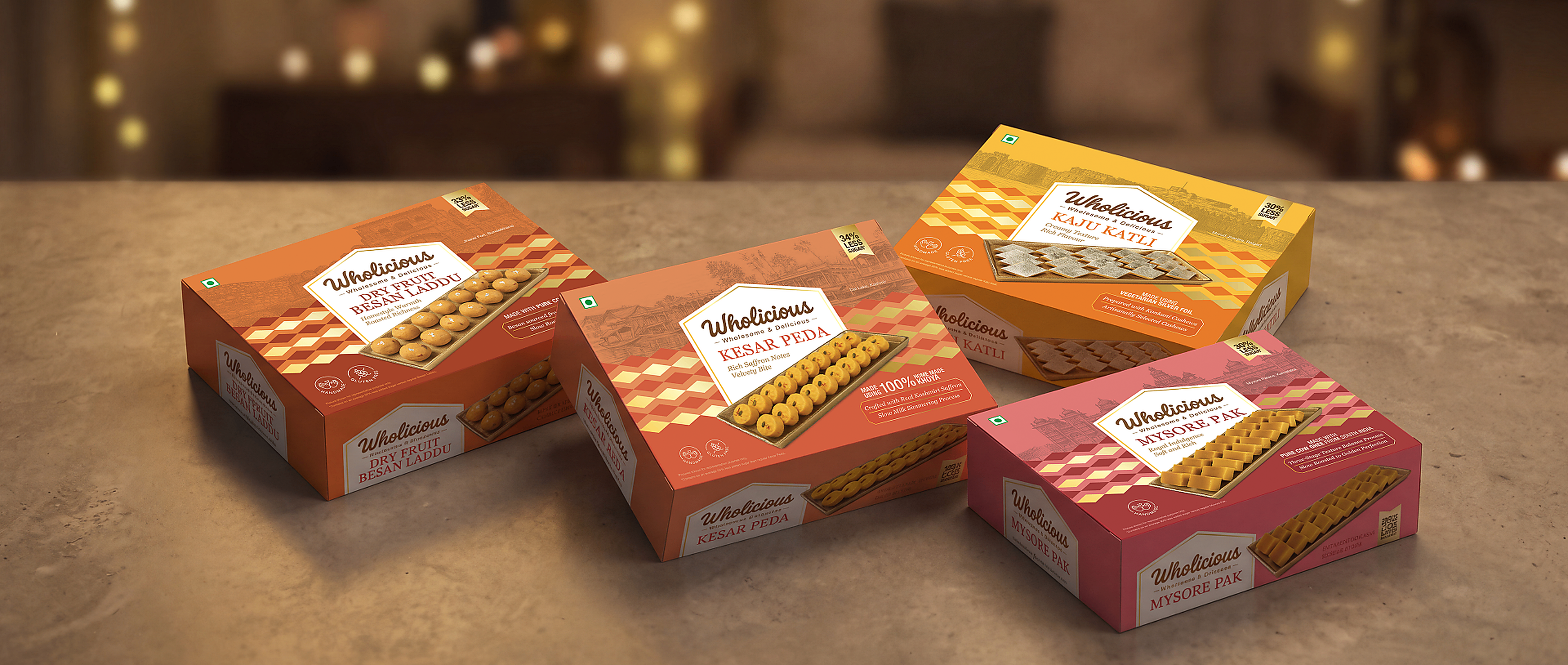
Wholicious came to us to launch a range of Indian mithai with 30-35% less sugar than regular mithai. Their target audience was health-conscious buyers who want to indulge in Indian sweets while staying mindful of what they're consuming, without compromising on the quality of ingredients. The brand wanted packaging that still felt festive and connected with this audience, while looking distinct from a typical mithai box.
OUR APPROACH
Wholicious sourced every ingredient directly, with no middlemen involved, so what went into each mithai was traceable, authentic and of the highest quality. Their preparation methodology stayed rooted in traditional, authentic Indian methods, and the mithai itself remained true to what people know and love, with one value add, 30-35% less sugar than regular mithai.
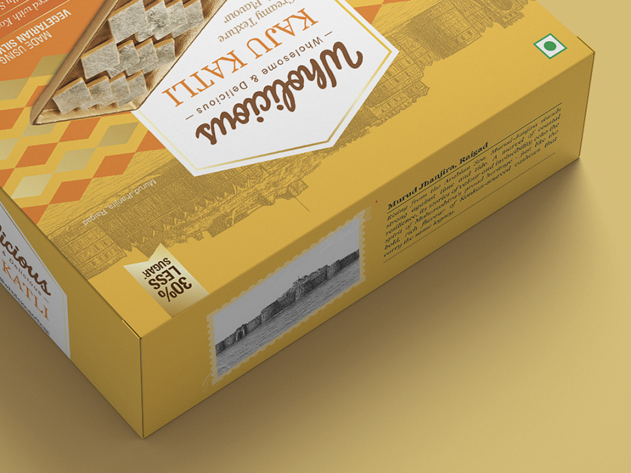
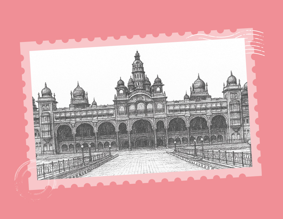
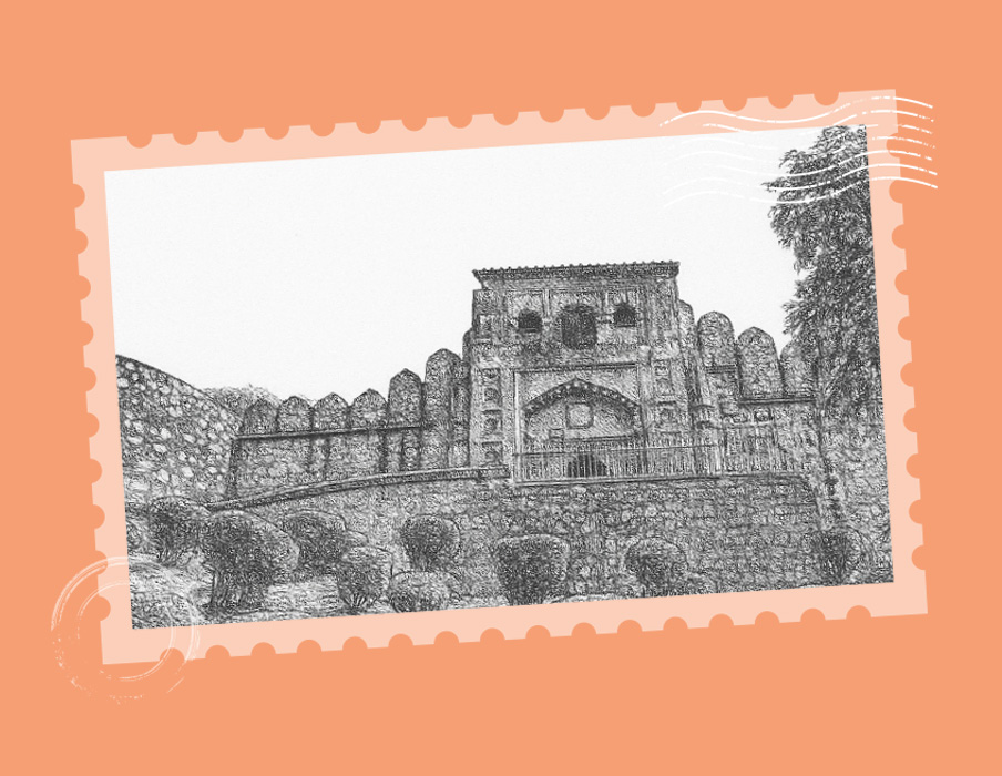
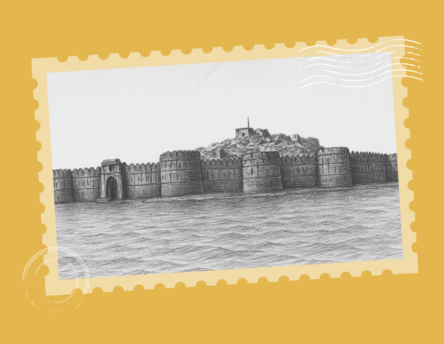
We took this story and built it into the packaging itself. Each ingredient's origin was connected to an iconic Indian heritage site or location, brought to life through illustrations, with a bit of trivia or story tying the ingredient to that place. So the pack wasn't just telling people what was inside, it was also taking them through where it came from, reinforcing Indian culture and heritage along the way.
PACKAGING
Illustrations of the ingredients and their heritage locations were created for each pack, keeping the story as the hero. Instead of typical ornamental graphics, bold gold shapes were used to anchor the range and give it a distinct festive character. The colors stayed vibrant, keeping the packaging festive while ensuring it stands out, whether on a retail shelf or as a hundred-by-hundred pixel thumbnail online. Overall, a contemporary style direction was chosen, keeping the look simple, sharp and shelf and qcomm-ready.